How to Design LMS to Boost User Experiences? Best Practices for Business Owners
Keeping learners engaged can be challenging, and learner experience is often held back by poor design. That’s why you must keep an eye on how to design LMS to boost user experience and maximize ROI.
So, if you are considering venturing into a best design LMS, this article is for you.
We’ll explore the key principles and strategies to design LMS, from intuitive interfaces and responsive design to engaging visuals and seamless navigation.
I. Why You Need a Custom LMS Website Design
An LMS is super important for online learning, whether for schools or businesses. This system helps learners or employees have a better learning experience, makes it easy to access materials quickly, and supports teachers in organizing and tracking courses.
Imagine the frustration everyone feels with a poorly designed LMS. To avoid this, the design should be easy on the eyes and user-friendly.
When users enter an LMS, the first thing they notice is the LMS’s interface including welcome screens, menus, icons, search fields, and more. These elements should be intuitive and simple to use to make sure that users have a smooth experience. Complicated steps only make things harder.
That’s why every company needs to think carefully about how to design their LMS. A well-designed LMS means no special instructions or long lessons on how to navigate the system are needed.
II. Top 5 LMS Website Design for Inspiration
Now, let’s walk through some great examples of design LMS that we’ve picked to spark your creativity and help you come up with beautiful ideas.
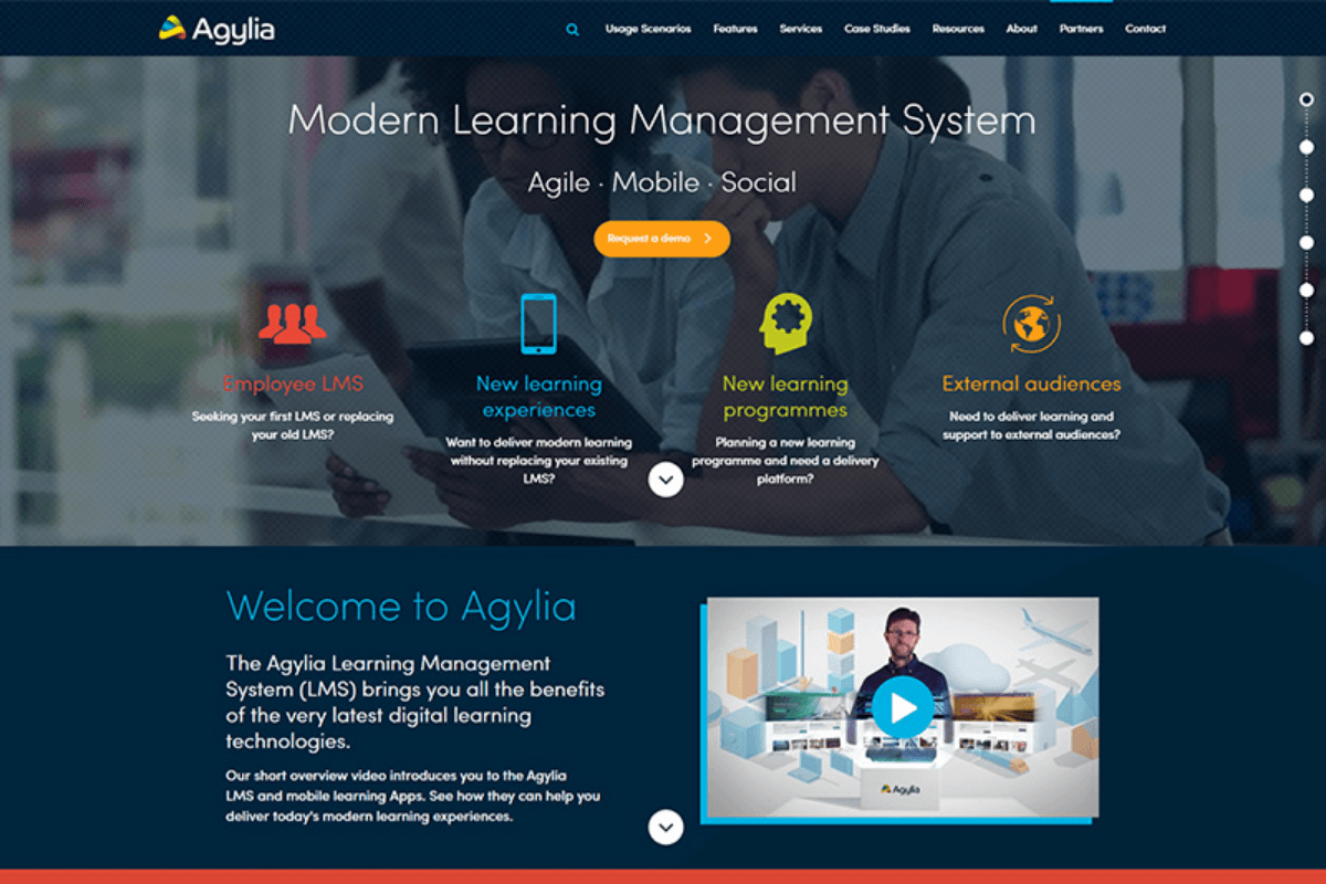
1. Agylia
Agylia features a clean design that balances visuals, text, and CTAs perfectly. The background is transparent, showcasing a harmonious blend of dark mint, blue, and purple.
2. Arlo
Arlo is a training management software aimed at commercial training providers looking to automate their data. They offer a comprehensive solution that integrates various systems into one platform. Arlo’s design is minimalist, yet striking, with clear screens and well-placed CTAs. The use of yellow highlights keeps the user’s attention.
3. LeanWorlds
LeanWorlds’ website is more visually rich than Arlo’s, with a strong focus on product presentation. It effectively uses blocks, pictures, infographics, and other graphic materials to make navigation easy and engaging.
4. iSpring
iSpring’s website uses bright colors against a white background, creating a visually appealing experience. Despite having many elements, the navigation is clear and easy to follow.
5. LearnUpon
LearnUpon’s website is highly interactive, featuring a support chat with live agents and animated design elements. The colorful design adds to the positive visual experience.
III. Must-have Components of a Great LMS Website Design
Before developing an LMS, you should consider the key components to design LMS. The best LMS website designs achieve multiple goals simultaneously. While there’s no strict formula for a perfect design, some useful tips can make your website more attractive.
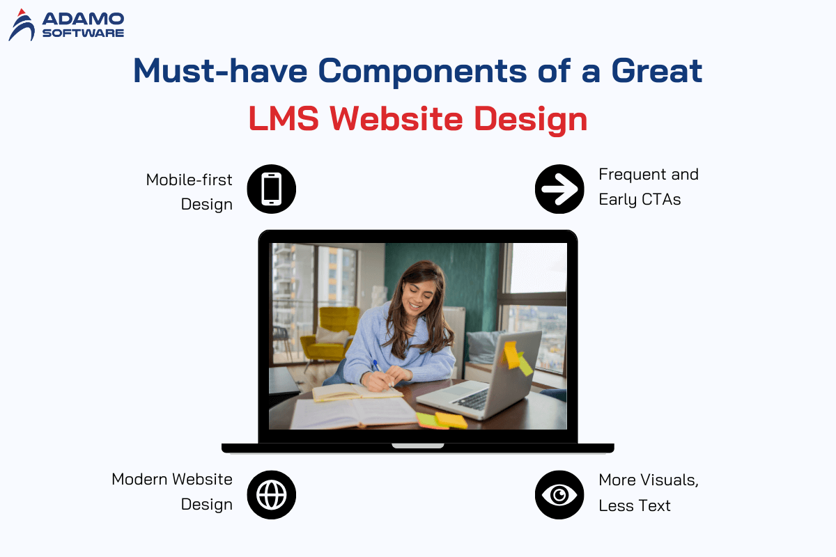
1. Mobile-first Design
Instead of starting with the desktop version, consider a mobile-first approach. With 55% of initial page views coming from mobile phones, designing for smaller screens first helps focus on key UI elements and minimizes later adjustments for desktop versions.
2. Modern Website Design
A modern website is crucial for making a good impression. Your site should be as appealing and high-quality as the product it represents. Think of the website as a vital part of your marketing package – it’s the bridge between the consumer and your solution.
An engaging and intuitive UI from the first interaction encourages users to continue their journey through the sales funnel.
3. Frequent and Early CTAs
While the main goal of your product website is to inform, converting visits into leads should be a priority. Encourage visitors to set up demos, start free trials, and read blog articles. Also, remember to always include calls-to-action to prompt user engagement when design LMS.
4. More Visuals, Less Text
Albert Einstein said, “If you can’t explain it simply, you don’t understand it well enough.” This principle applies to your website copy and CTAs. Understand your audience’s needs so you can write less and focus more. Also, use visuals and white space to convey information succinctly. Offer just enough details to provoke curiosity and encourage visitors to contact you for more information.
Before designing, define your feature set. Our guide on LMS features lists the must-haves for an effective platform.
IV. Step-by-Step Guide to Design LMS and Maximize ROI
Designing LMS platforms is a complex but rewarding task. We’ve prepared a step-by-step guide to help you create a valuable product and understand how to design an LMS system.
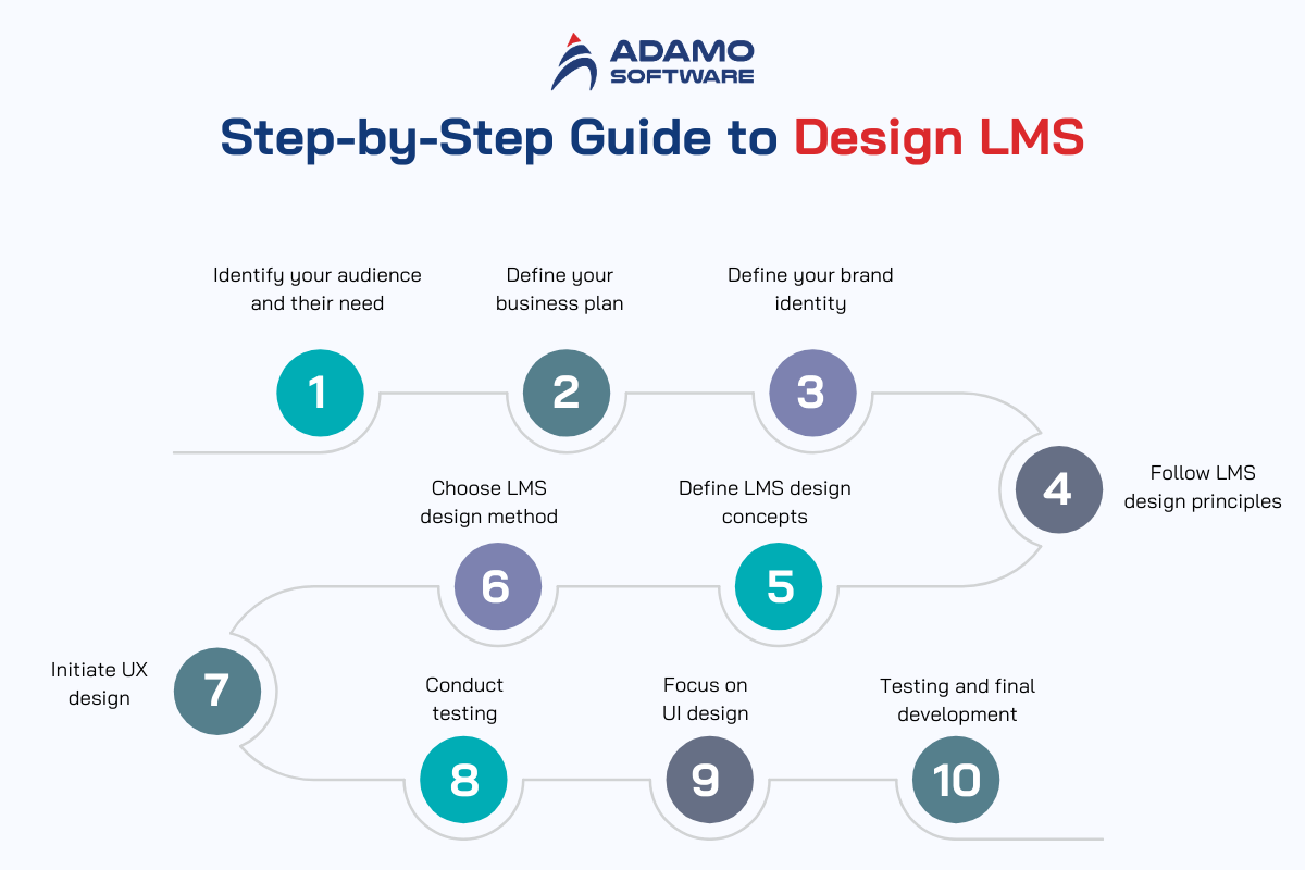
1. Identify Your Audience and Their Needs
The look and usability of the UI, along with its ease of use, shape the user’s first impression and satisfaction level. The placement of control elements also impacts usability.
Hence, identifying your target audience is crucial for developing both the UI and UX design of your project. Knowing your target audience allows for timely adjustments and enhances the overall profitability of the product.
Expert checklist:
- Spend time understanding and living the customer’s journey to better grasp their needs and preferences
- Study your competitors and their communication strategies
- Identify their target audience to avoid common mistakes
- Directly ask your audience what they want through surveys
- Offer incentives like discounts or special deals to motivate responses
- Run broad advertising campaigns and observe the response from the initial customers. If the ads resonate, you’ve likely identified your target audience
- Use this insight to refine your customer profile and move forward
2. Define Your Business Plan
Creating a business plan is vital to assess the project’s prospects and identify potential challenges early on. Process of design LMS is complex, so don’t start without a clear plan or strategy.
In skilled hands, a business plan is a powerful project management tool. Thoughtful planning allows you to identify problems in advance, pinpoint weak areas, and ultimately promote more efficient project development.
A well-crafted business plan should outline the key aspects of your project, analyze potential risks, and provide recommendations for minimizing those risks.
3. Define Your Brand Identity
Brand identity encompasses the emotional components (visual, auditory…) that create brand awareness, differentiate it from competitors, and enhance communication synergies.
With a strong brand identity, you can determine your company’s development strategy and focus on the entire marketing mix: pricing, product management, communications, and marketing channels. Brand identity can help establish a special relationship between consumers and the company.
Here are some basic methods of branding that you can incorporate to design LMS:
- Geometric ornaments or patterns
- Color schemes
- Letters, words, or phrases
- Lines
- Unique artistic styles
- Vertical and horizontal elements
- Simple details
4. Follow LMS design Principles
Key aspects to follow for a successful LMS website design and implementation are attractiveness, easy navigation, intuitiveness, branding, and responsiveness.
Attractive Design
Visual appeal is crucial. While it’s tempting to include every possible design element – animations, unique layouts, flashy graphics – simplicity is often more effective. A clean, attractive design should complement functionality, not hinder it.
Easy Navigation
Good navigation is crucial to design LMS. Users should be able to find elements and complete actions easily. Ensure the navigation is free of technical issues, all links are functional, and the learning path is logical and clear.
Intuitiveness
Every element, especially icons, should be recognizable and self-explanatory. The menu structure should be consistent yet adaptable to different users’ needs.
Branding
Incorporate logos, color schemes, shapes, and graphics that reflect your brand. Include company descriptions, mottos, and encouraging messages for learners and teachers. Aligning your brand with your software helps with business promotion and establishes the learning materials as your own.
5. Define LMS Design Concepts
Define a concept before you start designing. This overarching theme and message should permeate the entire system. Look at successful LMS examples and identify what attracts users to their platforms.
6. Choose LMS Design Methodology
Choosing a learning framework early will help during the LMS implementation stage and beyond. Two common methods are:
- ADDIE (Analyze, Design, Develop, Implement, Evaluate): This method involves improving each stage before moving to the next. It’s thorough but may lack flexibility in changing environments.
- SAM (Successive Approximation Model): This method emphasizes constant iteration. It’s more flexible and allows for continuous improvement.
Both methodologies benefit from the expertise of an experienced Instructional Designer, though modern LMS platforms enable anyone to start developing courses.
7. Initiate UX Design
A poor user experience can significantly impact whether users return to your LMS. In fact, 88% of online users are less likely to revisit a website after a bad experience, and the same applies to LMS users. A frustrating UX can leave learners feeling disengaged, overwhelmed, and irritated.
To ensure a great LMS UX design, consider these questions:
- Is the design intuitive?
- Is it easy to use?
- Is it well-organized?
- Is it enjoyable to use?
Your LMS design should be as straightforward as possible. If learners can navigate the LMS effortlessly without feeling overwhelmed, you’re on the right track. The design should be so intuitive that users don’t need to question why certain features exist – they should be able to explore the system without any difficulties.
8. Conduct Testing
Testing is a crucial step in the LMS design process. Visual elements like fonts, colors, alignment, and images are important not only for ease of use but also for conveying your brand’s personality.
Effective branding relies heavily on visual aesthetics, so it’s crucial to test their impact on users. Select participants from your target audience for this process. They don’t need to be design experts; people don’t need special training to know what they like.
Users typically form an opinion about a design within ten seconds. However, it’s not enough to simply ask if they like it. A structured approach is needed, which can be divided into two main parts:
- Introduction to visual stimuli: Show the design LMS to participants. This could be a picture, prototype, or live interactive site or application.
- Assessment of user reactions: Gather feedback on the design through open-ended or controlled questions.
9. Focus on UI Design
An LMS is only valuable to an organization if many learners use it. Therefore, the LMS must be easy to use – if learners find it difficult, they’ll likely disengage.
The UI of an LMS is how learners interact with the platform. Components like icons, buttons, lists, search bars, welcome screens, and news feeds all contribute to the user experience.
For a positive learning environment, interactions with the system should be smooth and straightforward, so the UI design should be clean, attractive, and user-friendly.
10. Testing and Final Development
The visual design you’ve tested can be adapted to various research types. When assessing visual design, consider showing participants an LMS web design template.
If you present multiple design options, participants can identify what they like or dislike about each. Be sure to vary the order in which designs are presented, as this can influence their preferences.
After familiarizing participants with the design, evaluate their feedback to identify trends. This analysis, particularly from open-ended questions, will help refine the design.
Once you’ve created and tested your LMS UI/UX design, and gathered results, you can proceed with the full development of your LMS system. Take your time to ensure all important elements from each previous stage are incorporated.
Starting with user research is essential in a new project. This helps understand the user’s interests, needs, and motivations. Researching the target group will also reveal how easy the platform is to use, the challenges users face, and their overall experience with the product interface. Addressing the user’s needs is key to the potential success of any product.
V. How Much Does It Cost to Design LMS
LMS design costs can be categorized into three tiers: low-cost, middle-cost, and high-cost. Here’s an overview of the approximate prices for each category:
- Low cost to design LMS: Up to $10,000 – this budget typically covers an MVP design.
- Middle cost to design LMS: From $20,000 to $100,000
- High cost to design LMS: From $100,000 and up
The cost of LMS design is influenced by the complexity of the design, the styles you want to incorporate, and other project-specific factors.
VI. Adamo Software: Your Trusted Partner to Design LMS
Adamo Software offers extensive expertise in custom LMS development, with a variety of design inspirations. Our designers are dedicated to creating exceptional designs for external projects.

Top LMS website designs achieve modern aesthetics, a clear user experience, and contribute to client growth and retention. It’s crucial to entrust this work to skilled professionals. Our experienced UI/UX designers will help you prototype a product that meets all these goals.
Consider partnering with Adamo’s team of designers and developers for your LMS project. We offer various engagement models and can deliver scalable solutions for business or school management, self-education, or AI education software. We’ll guide you through advisory, development, and deployment stages, ensuring transparency throughout. Let’s discuss your LMS design vision and collaborate to bring it to life.


