How to Build Online Streaming Platform: Features, Tech Stacks & Costs
We'll explore the keys of building an Online Streaming Platform: The fundamentals, different platform types, essential features, and the tech stack.

Adamo Software reach the leading Vietnam software outsourcing company, delivering custom software solutions with the latest technologies in travel and tourism.

We are leading healthcare software in Vietnam, providing innovative software outsourcing solutions for healthcare with the rise of cutting-edge technologies.

Our dedicated development team has built successfully several fintech solution projects that are tailor-made for every project requirement, leading market.

Our dedicated development team has built successfully several fintech solution projecOur services of developing food & beverage software provide you with a series of realistic features from basic to advance for ordering apps in roundly 15 mins.ts that are tailor-made for every project requirement, leading market.

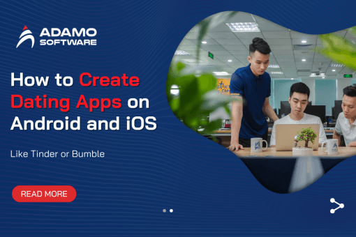
Adamo's dedicated team have created successfully some social networking apps, dating apps and web-based solutions in the media and entertainment industry.

With profound technological knowledge and experiences in diverse industries and skills of our developers, Adamo team offers education, e-commerce and retail.
We’re going to explore the top 15+ mobile app design online concepts to provide design inspiration for your upcoming project. Check it out.
Businesses are creating more seamless and pleasant mobile app experiences than ever before. This is partially because the ever-changing Google algorithm has been favoring mobile-friendly apps, and this trend is likely to continue into the next decade. Why? What are people doing on their smartphones?
It’s quite straightforward. There have been more mobile search queries, and 88% of our time is spent on an exponentially increasing number of apps. If you’re looking for inspiration from charming apps sprouting up everywhere, these are the best Mobile App Design Online currently available.
The mobile user interface or mobile app interface design is what is displayed when an app is utilized. Mobile app UI consists of the visual representation, interface, navigation, and processes that operate in the background of the mobile’s app structural and functional actions.
Mobile app interface design and user experience (UX) are of equal importance. UX is how the app looks and works as a whole, while UI is everything you do in the app to connect with it. In short, making an app with good user experience (UX) and mobile user interface design (MUI) techniques leads to an app that is appealing and easy for users to use.
We will present a selection of mobile app design online that excel in terms of user experience, aesthetic appeal, and overall functionality.
Are you looking for less talk and more action? Bananas App is “reinventing group chats” by letting friends share ideas with a touch or a tap.
The point? To turn endless group chats into activities that friends can do together, like getting out for a drink, playing frisbee in the park, or taking a spontaneous road trip. When you swipe right, you join a chat group where people can talk about times, places to meet, carpooling, and other details.
The designers of the Bananas App made the user experience look like it was made in the 1980s, with bold fonts and bright colors that fit with the fun idea behind the app. Using lively micro-interactions and graphics, the app gives users a fun and immersive experience. Users can add a new action with just a few clicks because the layout is simple and easy to understand.
The Bananas App is a great mobile app design online example of how designers can mix technology with real-world interaction.
Zero is an app that helps you keep track of how often you fast and gives you tips and coaching from doctors. Get information about your weight, heart rate at rest, and sleep to see how they change as you fast. There is also a journal where you can quickly tell the app how you feel while fasting by using emojis.
The designers of Zero have done a great job of keeping the mobile app design online simple while showing a lot of material with detailed insights and analytics. The app uses bright green and orange colors to draw users’ attention to important information and call-to-action buttons.
The main footer menu gives users four links to the app’s most important features. This makes mobile app design online easy to find what you’re looking for quickly. The app has over 345k reviews on the iOS App Store, and the average score is 4.8, which shows how much people love the product and how it works.
Wealthsimple lets people handle their money based on how much risk they want to take and how much they want to invest. Wealthsimple makes it easy to learn about stocks and diversity by giving you a portfolio to put money into for your future.
Wealthsimple needs a lot more personal details than other apps because it is a financial services app. Designers did a great job of carefully breaking up the training flow so that users don’t get too much information at once and stay interested.
The Wealthsimple Mobile App Design Online is easy to use. The user interface is easy to use and only shows the information you need to see your portfolio or add money to your investing account.
Sleepist is a meditation and sleep app that is great for people who have trouble falling asleep. You can choose from bedtime stories, bedtime music, or bedtime exercises to help you relax so you can sleep better.
The designers chose a dark mobile app design online style for the user interface (UI) to cut down on the effect of blue light, which makes it hard to sleep. Bright orange CTAs make it easy for users to find what they’re looking for quickly, which cuts down on screen time. Users can also set a timer for the app so they don’t have to look at their phone again before falling asleep.
Tumblr is one of the most popular social media sites for teens and college students. It’s a great place to find out about art and pop culture trends among young people. You can find some of the best jokes and GIFs on the internet there.
The material and community of Tumblr have inspired the mobile app design online. With bright colors, easy-to-understand buttons, and simple navigation, they’ve made the user experience fun and engaging.
Alive by Whitney Simmons is a health and exercise app for women that can be used at home to help them reach their health goals. The goal was to make health and exercise simple and easy to get to so that busy women could make it a habit without much trouble.
The designers did a good job of capturing this idea with a simple and easy-to-use user interface that makes it easy for people to find their desired workout. The soft color palette and simple layout make it easy for users to focus on the content of the product instead of getting distracted by features and mobile app design online elements that aren’t needed.
The fact that Alive by Whitney Simmons has over 18,000 reviews on the iOS App Store and a rating of 4.9 out of 5 shows how much people like the product and its material. The Best User Interface award for 2021 was given to the app by the Webby Awards.
Evernote is the most popular note-taking and productivity tool in the world, with over a billion users. The company has made it easier to take, sort, store, and share notes, which has increased efficiency.
Evernote is one of Apple’s “Editor’s Choice” apps, and it often wins the Work & Productivity Apps and Software Webby Award.
The mobile version of Evernote is just as complete and easy to use as the PC version. Even though there are a lot of mobile app design online features and choices, UX designers have done a good job of making sure that users only need one or two taps to make a note or a list of things to do. The Scratch Pad on the home screen lets users make notes without having to click any buttons. The “Evernote green” color makes it easy to find important CTAs in both light and dark modes.
ASOS is a popular online store for people in their 20s who want to keep up with the latest fashion trends. More than 850 brands and more than 85,000 items, like clothes, shoes, and accessories, are on the platform.
ASOS has noticed that their main market, young workers, spends a lot of time on their phones. So, ASOS has one of the best eCommerce apps for mobile devices, with a simple mobile app design online and high-quality pictures.
Color is only used to draw attention to CTAs so that shoppers can get to the checkout as quickly as possible. ASOS also lets you pay quickly with Apple Pay (iOS) and Google Pay (Android) on your mobile device. The ASOS app is designed to be quick and easy to use so that customers have as few problems as possible when making a purchase.
Duolingo is a star in the field of language learning, and its amazing mobile app design online makes it easy for its students to learn. When a student makes progress in their lessons, they see colored round icons that show where they are. It’s easy to add or remove languages, and there’s a screen that shows you everything you need to know about how you’re doing in Duolingo’s classes.
It is an app that lets people order hot coffee in different sizes and grades, depending on what they want. The UI has a unique drawing style. They made the coffee machine look great by using geometric shapes as graphic features. They used simple gray drawings and yellow buttons, which makes the mobile app design online look clean and easy to use.
As the name suggests, Instacart is an online store where people can choose a grocery store, pick out the things they want, and have them delivered on the same day. The app gives context by letting you tap on an item to see more information instead of just taking you to a new page. The pictures of the thing change position in a way that makes mobile app design online easy for users to see the change and remember how it looked before.
Its mobile app design online is made with black, brown, and green colors, which remind us of its image and the coffee itself. During Covid-19, they even changed the layouts so that people can order coffee even before they get to the cafe.
When you open the Starbucks app, it shows you which cafes are closest to you and lets you create your order right on the app. Its app is also cool because it shows the background of your drinks, which you can use to get rewards and bonuses.
Standout mobile app design online features:
Every SaaS website should highlight the product and its features. ActiveCollab excels by opting for a minimal, clutter-free page that does not deflect from the content and CTAs.
Notable mobile app design online features:
Bersus Design was born out of love, as the poet Byron would say. Den Sabrov worked in international trade and logistics by day, but he chose to follow his dreams and help startups and promising projects with well-designed UI/UX.
Bersus is a great example of his design theory, which is to avoid the traditional, overly complicated development process in favor of simple designs that stand out, especially on mobile devices.
Right away, it’s clear that his art combines simple, harmonious mobile app design online with raw energy. His artist image is a mix of Apollo, the Greek/Roman god of light and poetry, and Negan, an antihero from The Walking Dead TV series.
Even though the website is mostly black and white, it is not very complicated. It is very lively, with lots of motion effects and SVG animations, followed by interactive flip boxes that show a wide range of the creator’s work.
The few colorful pictures used here and there go well with the unusual, minimalist, and monochromatic mobile app design online, as well as the large amounts of space between elements.
The most interesting thing about this website is the “About Me” page, which has a dial for “My Strongest Skills.” The whole page screams brilliant information architecture and user interaction all in one neat package.
Standout mobile app design online features:
As their name suggests, UXpert is a leading UX design company from Israel that focuses on a wide range of digital services that are geared toward the user.
The website has a lot of white space, which gives it a clean, simple look. However, its main draw comes from the way it combines subtle motion effects and smooth transitions with a bright but on-brand yellow color.
Alternating blocks of amber and white make certain parts of the text stand out. For example, logos and comments from clients stand out very well against a white background when they are surrounded by color accents.
The full-screen showreel of the studio’s (mobile-first) work is perfectly merged into the design of the homepage, making it the clear star of the page. Even before users click the play button, the website starts “playing” scribble, rearranging the words YOUR, OUR, and USER above the tagline “Experience Matters” to clearly and jokingly communicate the brand’s mission: It’s all about the experience.
As you scroll down, you can see that it makes good use of room and words. The UXpert website can breathe easily because it doesn’t have more content than it needs to. It doesn’t have too much written or visual material.
Kinsta, an IT services company based in California, was started in 2013 by people who wanted to change the way things were. Their goal was to make the best WordPress hosting platform in the world.
Based on their motto, “obsessed with performance,” Kinsta made their website with this goal-oriented way of thinking. From the moment a user lands on a page, they are taken on a smooth, focused trip. Different animated aspects are not there to entertain but to show what services are available.
The website is easy to read and understand because of how it is set up. With the help of blue highlights and clever drawings, the interface is broken up into sections.
Each page is made to be a simple digital location that highlights the brand’s strategy and the most important parts of Kinsta’s solutions.
Even though it uses the same mobile app design online principles as the main website, the DevKinsta subpage that promotes the company’s best free tool looks like a dark version of the main website, which makes it stand out more.
Tagree is a Russian digital firm that helps big businesses stay ahead of the curve by making and promoting high-quality brands, websites, and web services.
Every website should try to go above and beyond what people expect and push the limits, and Target does both with its unique mobile app design online solutions and unusual website flow.
It uses an odd mix of horizontal layout and custom, almost fluid transitions. Horizontal scroll is a great addition to web design that makes reading fun and interesting. It can be hard to do well, especially for mobile users who are used to constantly pushing their thumbs up and down.
Tagree knew they had to make a strong visual statement first if they wanted to show the quest for innovation simply.
The menu access in the top right corner of the screen is one of the more complicated parts of the website’s user interface. When you click on the hamburger menu icon, a full-screen menu with links to important parts of the conversion funnel shows up.
With a great mix of subtle but techy animation, changing images, interactive elements, sticky CTAs, and typography, the whole browsing experience makes you want to explore the website in depth.
You can also gain insights on Top mobile app development platforms with our blog here
Now that you’ve seen some excellent examples of mobile app design online, it’s time to examine eight mobile app design online principles for creating user-friendly consumer experiences.
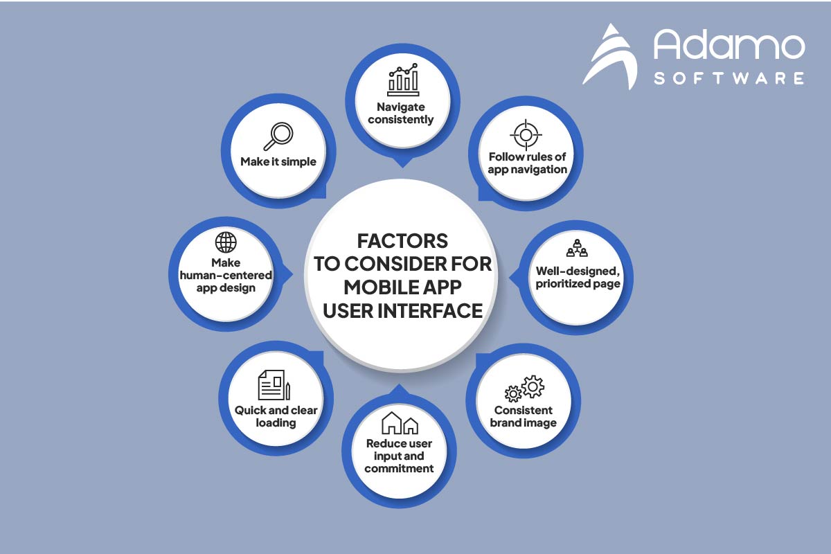
Consider the psychology of mobile app design online to avoid overwhelming users with content and information. As evidenced by the onboarding sequence of Wealthsimple, ensure that instructions are explicit and break down large tasks into manageable steps.
Follow the “3-click rule,” in which users can access any part of your app with no more than three actions. Also, ensure that the experience of your mobile app mirrors the desktop and tablet versions. Wealthsimple, Evernote, Tumblr, and ASOS all serve as excellent illustrations of this principle.
Utilize globally accepted trends for mobile app design online navigation to reduce the learning curve of your product.
Ensure your app has a distinct content hierarchy and an easy-to-digest mobile app design online. Clearly label icons, features, and options so that users understand precisely what clicking a link or button will do.
Keep your mobile app design online on brand with consistent color palettes and content. Utilize the same navigational links for your mobile app as you do for your desktop and tablet versions.
Permit users to investigate your mobile app without completing tedious onboarding forms. Offer services such as Apple Pay/ Google Pay, location tracking, credit card scanning, and others to prepopulate input fields and forms. By reducing typing, you can get app users to their desired destination much more quickly, thereby creating a seamless user experience with mobile app design online.
Communicate system tasks such as encoding and processing so that users are always aware of what is occurring. Using percentage indicators or a countdown timer can help manage user expectations and decrease frustration.
Mobile apps must adhere to accessibility standards so that users with visual impairments and other disabilities can utilize your product. The built-in accessibility features of UXPin include a contrast analyzer and a color blindness simulator, allowing designers to verify that their work conforms to WCAG guidelines.
Read more about How Long Does It Take To Make an App to know app development timeline
As the top software development service company in Vietnam, Adamo Software offers excellent mobile app development and design services for enterprises from various industries from travel and hospitality software development, healthcare, social and entertainment software development to financial services, fintech. If you are interested in hiring a dedicated development team for their business ideas transformation, contact us for more information.